Whirlwind

My life has been a wonderful Whirlwind lately and I've barely been able to share news about projects I have been a part of the last few months.  

My publishing/production team at Tryptic Press finished our 3rd and 4th local artist catalog called Chroma. We were behind on our yearly schedule due to a high demand for us to show off 1-2 at art shows and conventions so we have  chosen to create two companion books at the same time! Look for Chroma volumes 3-4 on July 30th when we launch them in the main gallery at Montserrat College of Art!!!! Visit Event page

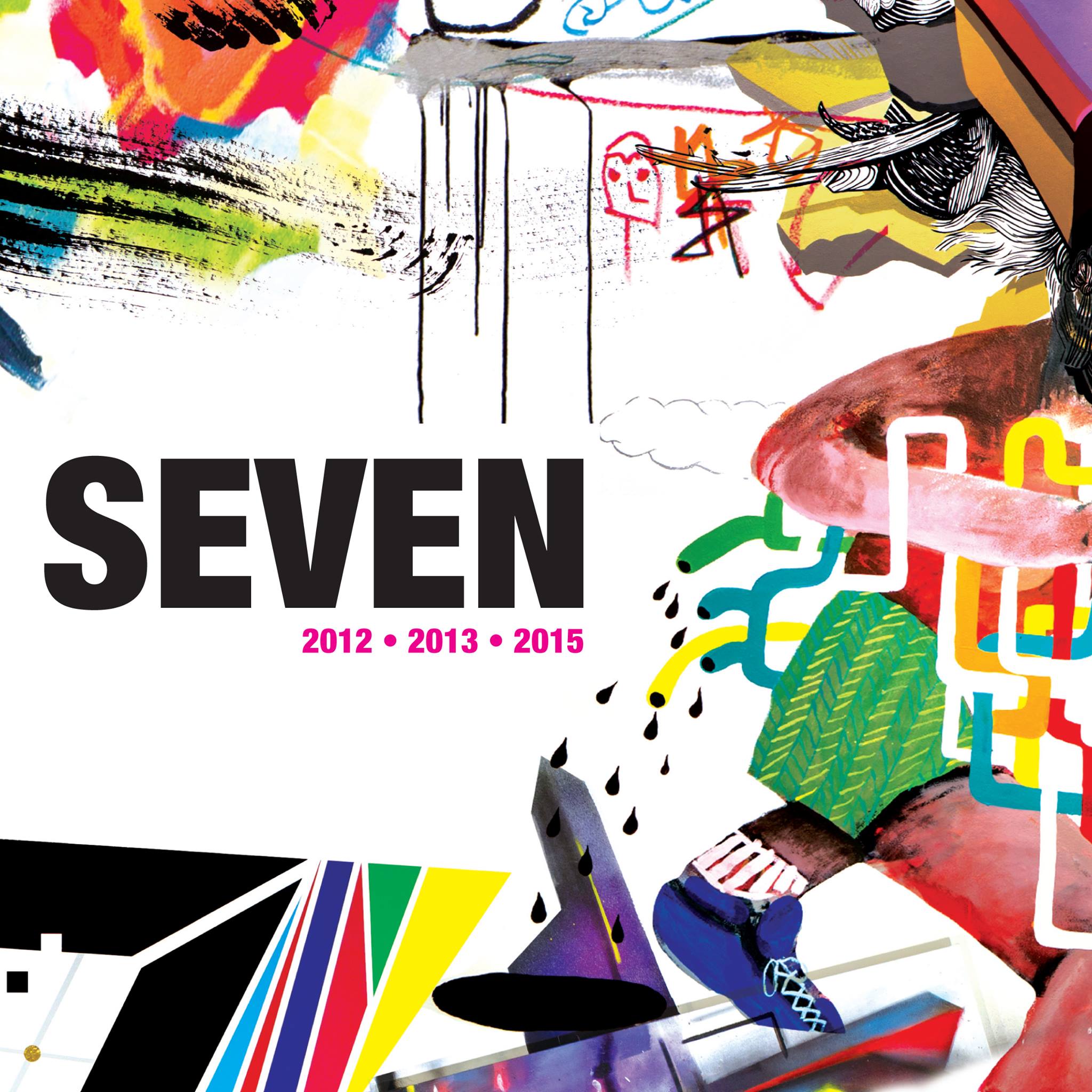
also on the docket is a book MCA commissioned from us. Since 2012 they have had a summer series called "Seven" where 7 artists spend a week painting a wall in their main gallery.  We were commissioned to design a book based on this series, spanning the years 2012,2013,2015. The release will be on the same day as CHROMA 3-4 Visit Event Page

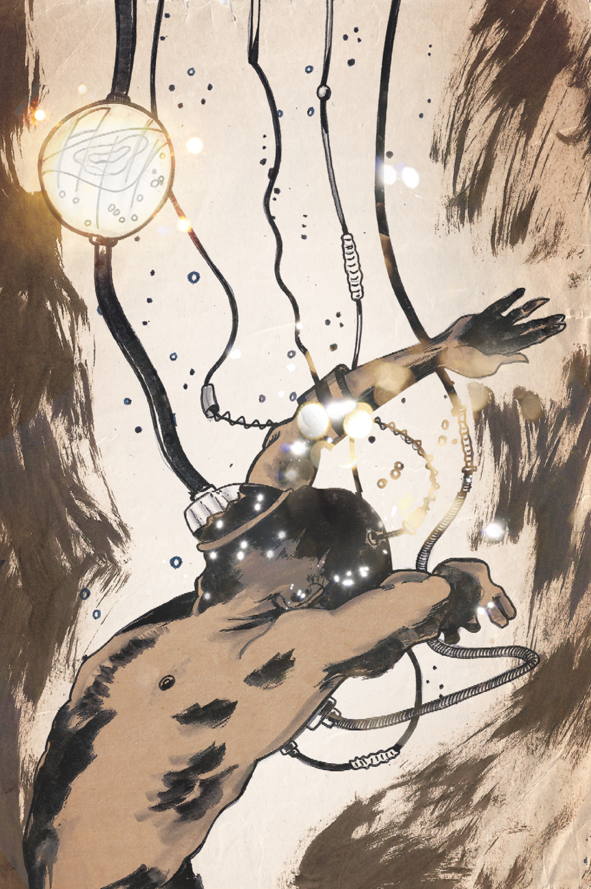
This month I am honored to be featured in the comic book "The Accelerators"  released by Blue Juice Comics. I will have a pin-up illustration in the back of issue 12. This was a great project as the Accelerators is a wild story of time travel told in gripping chaos and suspense. I highly recommend it. Check it out here

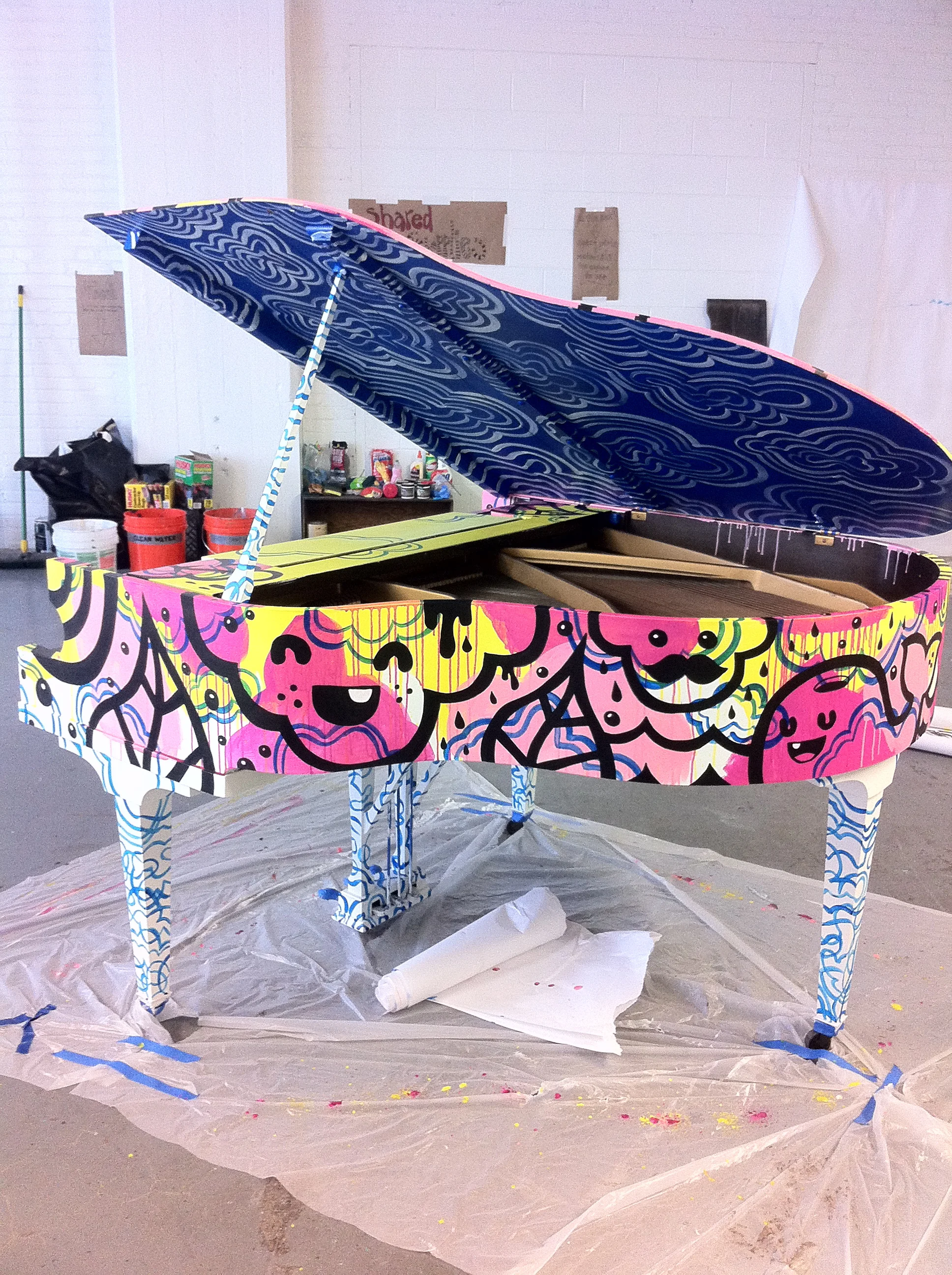
Ive also been selected, once again, to paint a piano for Boston's second installation of Luke Jerrum's, play me I'm yours. See my web site for the story behind my first time. It's an honor to be involved again as I eagerly await the day! Visit Event Page

2016 has been a productive year for me. Many changes have happened to me in the last year but nothing can stop my passion for making art.  
 

13502917_1050240095044613_1694784412587719153_o.jpg


Accelerator pin up

Manchester to Monadnock

I illustrated and designed this poster for an Ultra-Marathon in NH. It will be given to runners that complete the entire marathon. This race starts in Manchester, NH and  actually goes up and down Monadnock Mountain. CRAZY!

Mixing it all together

I'm beginning to get to the point where I'm mixing my worlds together. Pen and ink drawing colored by scanning found papers and digitally collaging them to build color and texture. I'm looking forward to exploring this idea more.

Boston Arts Academy/Visiting Artist

I was recently asked to visit a mixed media class at the Boston Arts Academy and demonstrate a few collage techniques I use. The students couldn't have been more attentive and driven. It was was pleasure to teach and talk about my process. 

April sketchbook

Needed a release this month after having two art openings and a few design projects. My head was spinning from too much business and taxes so I picked up a new pen after a buddy of mine (Monsta) suggested I try out the pilot parallel pen. I love it and still need some time with it before I totally get the hang of it. It really has variable line widths as well as a dry brush feel, all in one pen. Here are a few examples. 

image.jpg
image.jpg
image.jpg
image.jpg
image.jpg
image.jpg
image.jpg

Daredevil

This years Beverly Comic Con was bigger than ever and I had the pleasure of live painting during the event. I sketched out two versions of daredevil, one of his basic black mask and the other of his red suit. Here are the results. 

image.jpg
image.jpg
image.jpg
image.jpg
image.jpg
I even got a visit from Wilson Fisk.  

I even got a visit from Wilson Fisk.  

Brother's Rye logo

This was a very quick idea for a band logo. I based it off gravestone rubbings.  I used to love to rub charcoal over paper on old gravestones in New England; For some reason ( probably correct) you aren't allowed to do that anymore. 

image.jpg
image.jpg

GoldBlood & Associates art

I'm working with a powerful soul band out of Boston ​called Goldblood & Associates. This project was to design a mysterious invitation to a secret society. Paying card themed mixed with illuminati-like symbolism. 

image.jpg

image.jpg
image.jpg
image.jpg

Free-forming

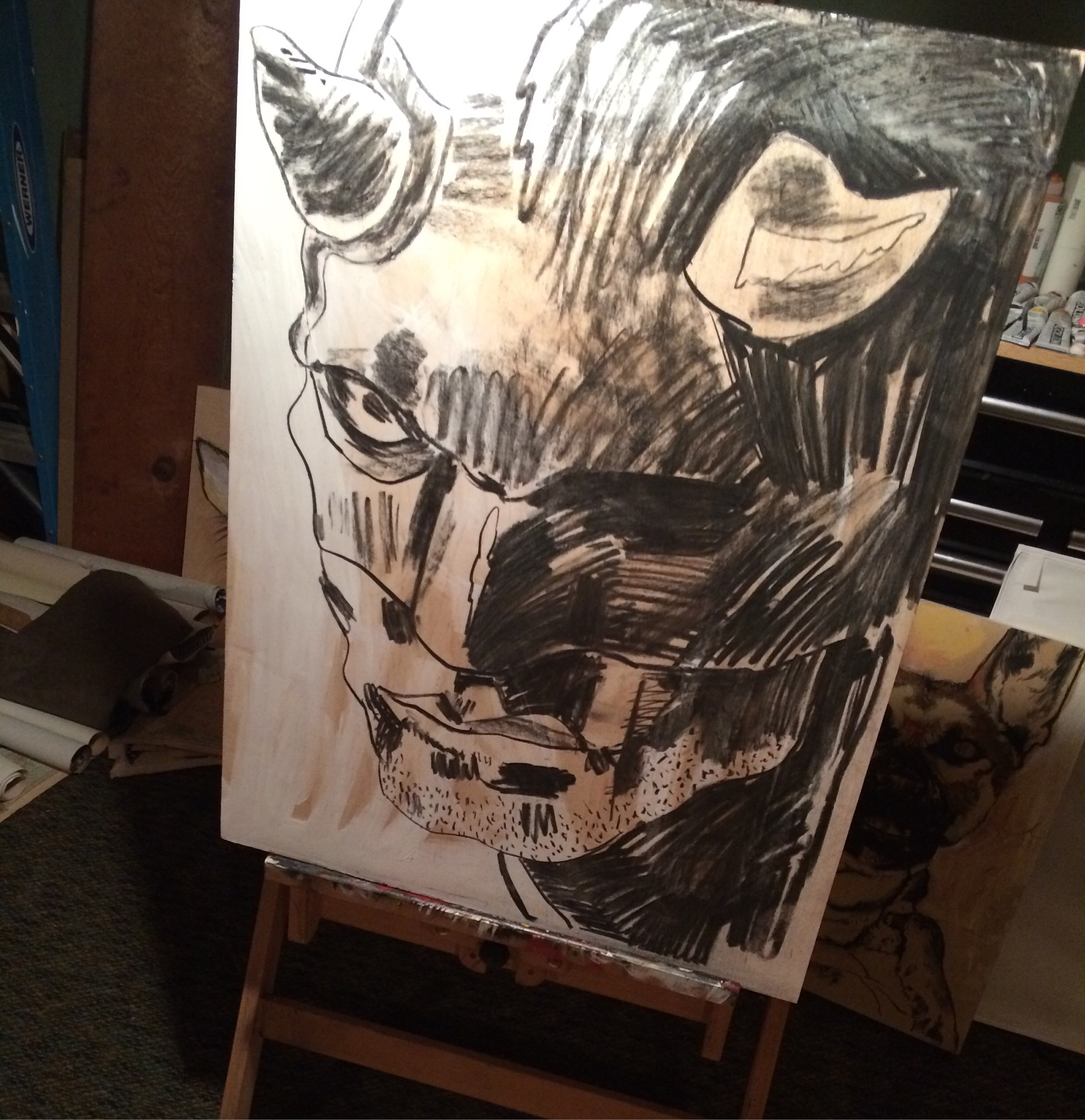
I've always enjoyed the way a drawing can be planned and designed around a theme as well as how an illustration can capture a true likeness. These drawings here do the exact opposite of what I just said. These drawings are specifically created by ignoring all the themes and plans completely. I simply apply a wash of ink, quickly painting in the form before it takes on a solid idea. I will then hit it with black ink, outlining as I flow around the unfinished forms. Sometimes a man and other times a women will appear but the idea is to let it happen rather than visualizing a final figure. These are quickly drawn and should have odd if not unique lines since no sketching is done to solve things first. 

image.jpg
image.jpg
image.jpg
image.jpg
image.jpg
image.jpg
image.jpg
image.jpg
image.jpg
image.jpg
image.jpg
image.jpg
image.jpg
image.jpg

Purse

Working on elements for a silk screened poster. The band Purse, from Portland, Maine asked me to whip up a transformational themed show poster for their November show at Space Gallery. 

image.jpg

I've accomplished a lot in a few hours. The elements have already been composed in Photoshop and  now I'm laying out the typography and color separations in illustrator. 

image.jpg
image.jpg

States of Terror

Update: Oct, 31

sneak peak at a draft copy of the States of Terror book coming out soon. This book will feature the Bell Witch illustration I did for the show.

image.jpg

Big thanks to Centerboard and vision space gallery in Lynn for including me in their newest show this month. States of terror showcases creature folklore of America. A state by state monster of a show! 

http://lynnhappens.com/2014/10/09/states-of-terror-opens-at-visionspace-oct-18/


image.jpg
image.jpg
image.jpg
image.jpg
image.jpg
image.jpg
image.jpg
image.jpg
image.jpg
image.jpg

Bell Witch

Recent Illustration project for possible inclusion in a new publication. Details coming soon. 

image.jpg

I'm still figuring out the flow of the dress. The finished piece will make its way into Photoshop. The final will be black and white. 

image.jpg

Another version to choose from. I think the first one feels more vintage horror while this one is a little more southern bell. 

image.jpg

Working on background here. A view of the moon through an arched window. I'm trying to create a dark, southern farm house setting. The witch floating through a hall or stairway. Working in separate layers allows me to correct the drawing easily without hurting the background. Now to scan them in and begin the black and white digital collage. 


image.jpg

It's now in Photoshop and I've spent about 6 hours on it already. Cut paper, scanned and digitally manipulated under the drawing. Light effects and filters bring out the texture in the paper and seemlessly blend with the drawing. 

image.jpg
image.jpg
image.jpg

Digging through the dirt.

I've been rummaging through some drawings from the end of 2013 and early 2014 and found these pieces. I think I would like to explore this again. 

image.jpg

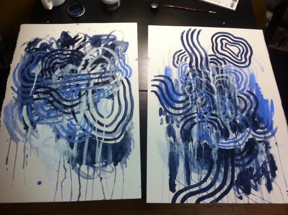
I used paint markers on heavy drawing paper, acrylic paint and ink. I like the drying speed the markers have and how I can jump from swirling line work to dripping splotches of color using the same tool. These proved to be decent backgrounds I could include or block out. 


image.jpg

I used photos I took at a modeling session at the old studio in Somerville (I live in Rolindale now). 

image.jpg
image.jpg

I think I dropped some off with eyeformation to play around on. I can't wait to see what he adds to them. 

image.jpg
image.jpg
image.jpg
image.jpg

Boston comic con 2014 sneak peak.

BCC. 2014 is fast approaching and I have a few super surprises to show at my table. Although I'll be there to represent Tryptic Press' new edition of CHROMA I'll have prints for sale of my work and as long as I keep busy I'll have a few original sketches for sale too. 

I'll have prints available of this spidey head and phone covers can be ordered through my store. 

I'll have prints available of this spidey head and phone covers can be ordered through my store. 

image.jpg
image.jpg
I've used references for some of these poses from classic Spider-Man stories. I'm trying to capture familiar favorites. His agility is so much fun to play with. 

I've used references for some of these poses from classic Spider-Man stories. I'm trying to capture familiar favorites. His agility is so much fun to play with. 

image.jpg
image.jpg
image.jpg
image.jpg
image.jpg

I've started to scan them in and add a background. I'm still playing with the lighting but overall I'm getting this silver tone I like a lot. 

image.jpg

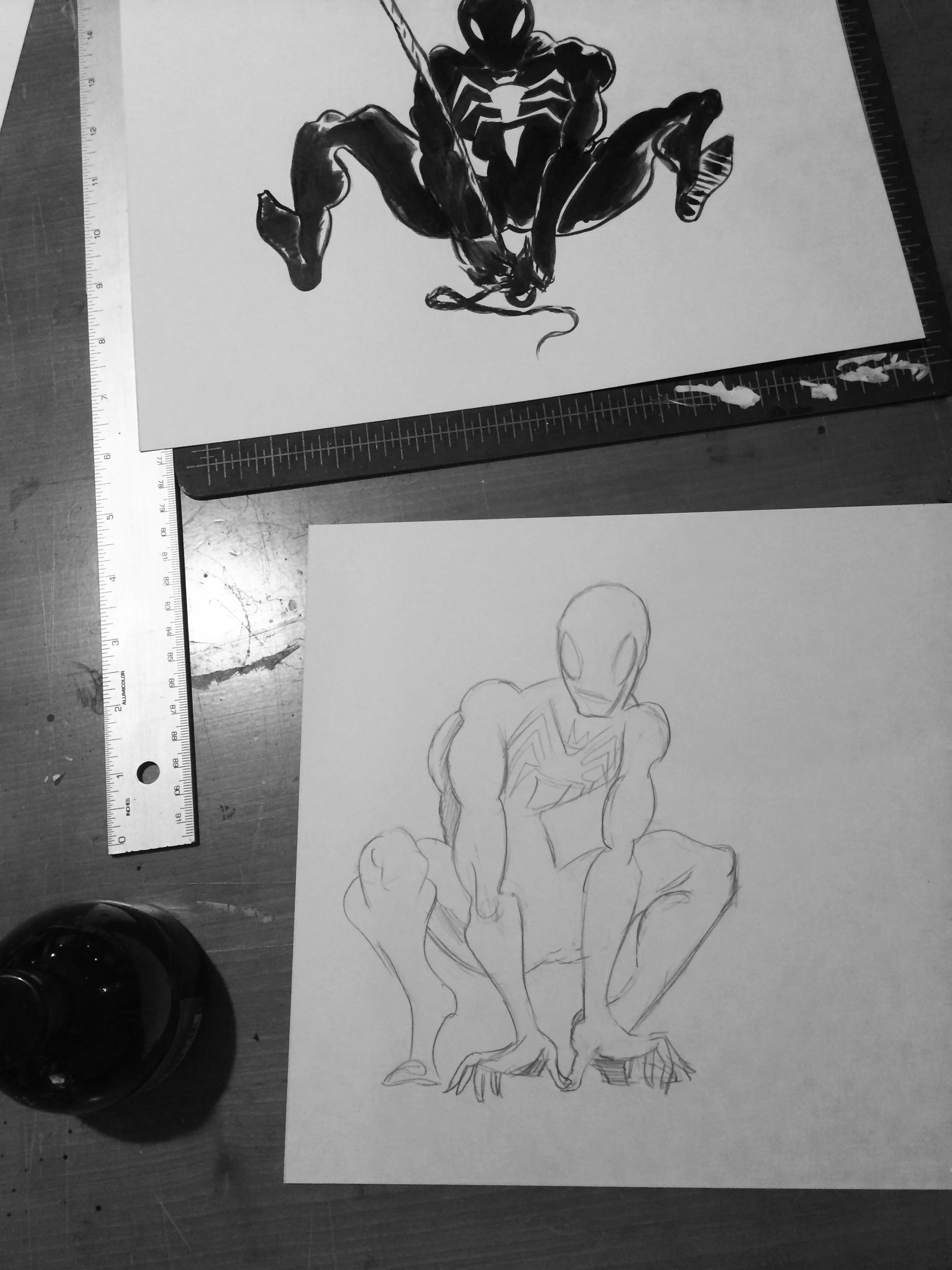
Quick look at the pencil stage. 

image.jpg
image.jpg

The con is officially on and my booth is set. I'm drawing away on con sketches and I'm noticing that unless I add some guardians of the gallaxy material I may as we'll go home. So here it goes. 

image.jpg

I made the right decision drawing groot and rocket raccoon. They were the official stars of GOTG and as soon as I finished drawing them they flew off the table and into the hands of some very happy con visitors. Here are a few shots of commissions I got on Sunday. 

image.jpg
image.jpg
image.jpg
image.jpg

I also drew a ninja turtle and other personal favorites. 

image.jpg
image.jpg
image.jpg


Illustrated Logo

It's not often I get asked to hand draw a logo, but when I do I truly enjoy the job. This logo was a great project that challenged my ability to tie together the photographers area of work and love for the island of Martha's Vineyard. This logo needed to be both feminine and masculine to attract the bride and groom to choose Tim as their go to wedding photographer.

Tony Sgroi

I stumbled across a beautiful book in my finance, Meghann's collection (now mine as we'll ;) "Edgar rice Burroughs, Tarzan and the City of Gold"  illustrated by Tony Sgroi. I was first impressed by the quality of the illustrations and then I saw the duo-tone, pink and green and thought, how beautiful this simplicity is. Solid, bold line work paired with a flat, solid color gets me every time. 


image.jpg
image.jpg
image.jpg
image.jpg


image.jpg
image.jpg

Fantastic design.